Terror of the Autons
22 May 2011The starting point for this cover was the sole, semi-decent photo of a masked Auton that seems to exist: the one of it lying on the ground with Captain Yates kneeling over it pointing his gun. The upsides were that none of the detail of the carnival mask is obscured by Yates, only the brim of its hat, which can easily be cloned in, and that I had a good sized copy of it (kept from a long-ago cut-up copy of 'The Adventures of K-9 and Other Mechanical Creatures'). The downsides were that, being mono, it'd need colourising, and that because the Auton is lying down (but can be made to appear standing simply by rotating the image), the shot is from a very low angle. So my initial concern was whether I could get this to work in a composition given the extreme perspective (I find the varying character perspectives on Clayton Hickman's official cover to be rather clumsy, to be honest).
The solution came when I was researching other images for the illustration, particularly of the Master -- the other key element for my cover (after the Doctor, of course). Of several taken at the photo-shoot at the circus, there was one of Delgado at a similar low angle, and suitably facing to the left (given the Auton was angled towards the right). With this, I decided I could have these two figures standing side by side, each facing out of the cover and placed suitably high in the illustration to justify the low camera angle. They could then be looming over the Doctor, positioned in the bottom centre. For him I always planned to use a shot from that circus photo-shoot with him standing proudly, hands on hips (well, if it's good enough for my masthead). Indeed, I had intended to use the same photo as on the Velvet Jacket title banner, but in the event found a similar shot from a slightly lower angle that worked better given the already looking-upwards feel of the two villain shots.
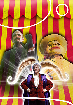 With the main images selected, my thoughts turned to what sort of background could tie them all together. My initial idea was of a striped circus tent, with the Master and Autons appearing projected onto the entrance flaps and Nestene tentacles emerging from the dark interior. A quick mock-up of this (right) didn't satisfy me, however. Creating the tent by hand, with shapes and textures, looked too fake, and the tentacles appeared to be emerging from the Doctor's head! With the Master and Auton needing to be placed as high as possible, I became concerned the bottom corners would appear too empty and require something adding. With this in mind, I thought it might be useful to have an element that would provide a cut-off line for the main figures, and so began to think of using the radio telescope dish as a suitable shape for this. An online search turned up a nice shot of the Lovell telescope at Jodrell Bank that seemed a good match for the model dishes in the show, and provided a lateral edge towards the bottom of the composition. This would also allow me to have the Nestene appearing in the sky above, which, although mostly hidden by the logo on the final cover, would peek out suitably. (And I know we don't see any proper Nestene tentacles in the final show, but having not used any on my 'Spearhead From Space' cover, it felt justified, and provided my own little homage to the Target book covers -- both Brookes' and Hood's).
And so to the execution. Cutting out the Doctor and Master were straightforward; the Auton was more complicated. To provide more interest and make it more Autony, and to reflect the Master's raised hand, I wanted to add in a hand-gun. But it depended entirely on finding suitable photos to create it from. Much searching turned up a suitable sleeve and separately a hand with the thumb in the right position (rather than sticking straight up as most people do when reaching to shake hands). One fortunate result of compositing these in black and white was that I only had to match greyscale levels, rather than colours. This particularly helped with the sleeve, which was originally a dark suit, but I could simply raise the levels and brightness to make it match the pale grey of the Auton's jacket (taking care not to lose too much shadow detail). I had anticipated having to recreate the inner workings of the hand-gun, but remembered a close-up in episode three as the Auton policeman fires from the car window, which luckily was pointing in the direction I needed. So I simply painted out the original hand's fingers and replaced them with the dropped-down gun version. With this all composited in mono, I could then flatten it and add colour in the usual way.
Finally, I decided the gantries of the radio telescope didn't fill the bottom corner sufficiently interestingly, so chose to add the extra figures. They perhaps clutter the illustration a tad, and I reluctantly had to resort to using screengrabs, but they fill a space and arguably add some extra 'meance' for the Doctor.
Download the final TERROR OF THE AUTONS cover here
