The Seeds of Doom
13 December 2010I knew from the outset with this cover that the main question would be whether or not to feature Harrison Chase. He's the story's big villain, of course, but I knew of no photos of him, and for once the disc's photo gallery disappointed. In fact there were surprisingly few photos from this story, concentrating on the monster (understandably) and, more oddly, the Antarctic base. So if I was to include him it would have to be via screen captures. I have done this a few times before, most notably for Miss Winters on my 'Robot' cover, but it's always tricky finding a suitable pose with the person standing still and in mid-shot. Scanning through the episodes, I was also on the lookout for a nice close-up so I could do a head transplant to get detail in the face. In the end, Harrison was composed from four images: head, torso and then two separate images for the lower jacket. In the original torso shot he was looking more to his left, so his shirt collar is a little twisted for his new head despite some correction, but on the whole I think it convinces sufficiently.
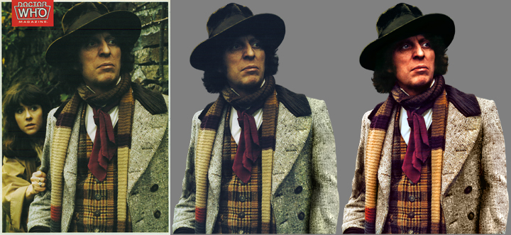
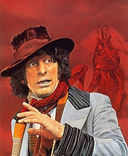 I also had to do some surgery on the Doctor as I really wanted to use this shot of him, but all the copies I could find were cropped on the right, removing his left arm. (In fact, I had hoped to use the shot as painted by Roy Knipe on his Target cover for 'The Invisible Enemy' (right), but I could only find black and white versions.) I began with a nice big scan from a full-page photo in DWM. Painting out Sarah's hand clutching his right elbow was simple; trickier was finding other photos of his coat in sufficient detail that I could recreate his arm from without the image quality being noticeably less detailed, and with the weave of the cloth at the right angles, especially as it would be fairly prominent. Once I'd patched in the area of the arm, I used a layer mask to create the right outline, then painted in shadows and highlights to give it some shape. Only once I was happy with the composition did I flatten it and begin the general tidying up of levels and colouring. I find in cases like this it's better to compile the image, then adjust it as a whole, rather than trying to match separate parts. Below are the original scan, composite and corrected image.
The other major element was the background. Once I'd decided I would have Harrison Chase on the cover, I pretty much had to go with a country house setting rather than a snowy Antarctic one, which seemed the more significant part of the story anyway and would allow me to feature the giant Krynoid attacking the house, which I thought would be fun to create. That led to the composition of having the Doctor in the centre (even though that meant filling in his missing arm), with Chase and a humanoid Krynoid either side and the Krynoid monster behind - assailed on all sides! Even though having both forms of the Krynoid in that setting wasn't faithful to the story, they're both iconic images so justified their inclusion. Scanning the Now & Then feature on the disc provided some nice shots of Athelhampton House - as it is now, of course, but it has changed little over the past 35 years. There were nice shots of the front of the house, but these were balanced to the left and I needed to have the Krynoid over to the right to fit the shape of my covers. A shot of the side of the house proved perfect. The sky was bleached out, so I had to cut out the skyline and add a new sky, but I need to do this to add in the Krynoid anyway, so it was no extra work. I also had to extend the foreground lawn, and an image search on Google produced a good expanse of grass at just the right perspective.
Having enlarged the Krynoid and positioned him atop the house, I wanted more interaction than it just sitting there, to have it attacking the building. Most fortuitous was a tentacle just where the prominent chimney was, so I cut out a chunk of the latter and positioned it mid-fall. I created a brick-shaped brush preset which, with appropriate scatter and colour variation settings, allowed me to paint in falling debris. A touch of motion blur, some dust and smoke, and the attack was underway. I added a touch of damage to the gables near other tentacles, but didn't want to overdo things. More dust rising below the Krynoid and some smoke in the background sold the concept well, I feel. Click here to see the clean background image.
Download the final SEEDS OF DOOM cover here
