


The Time Meddler
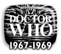
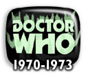
9 February 2008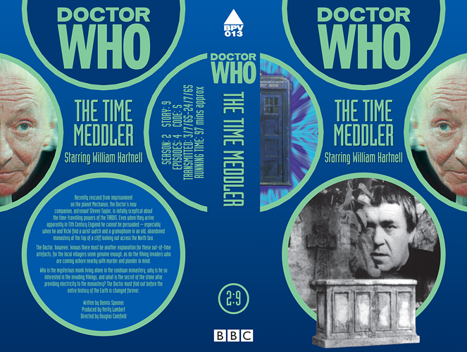 Like many, I suspect, I first saw 'The Time Meddler' when it was repeated in 1992 and thought it a cracking little story. With an off-air recording I never bothered buying the VHS release, though, so I'm very glad to get a pristine copy with this DVD (well, as pristine as the existing recordings can be made, but that's more than good enough for me). I mention this as the cover for my off-air tape became one of the first I ever made, back in the days when I was a mere Photoshop novice (see right - click to enlarge). As you can see, I adopted several elements of these video sleeves when I came to design my DVD covers, and in particular the compositions of the illos for the two 'Time Meddler's are pretty much the same. I had originally planned to use the same photo of Peter Butterworth, with him peering from behind a bush, but switch the background to an outside scene to match, using the set shot of the outside of the monastery, and probably getting a Viking longboat in somehow. In the event, I found the photo of the Monk peering round a column more appealing and better quality, which required the background to revert indoors, and thus I returned to using the shot of the sarcophagus/TARDIS. As it transpired, Clayton's official cover was set outside, so I'm glad I went the way I did.
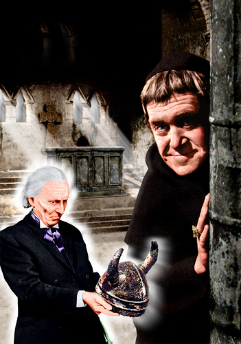
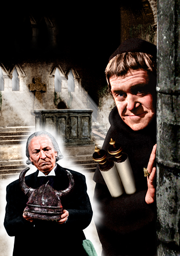 As usual with the black-and-white stories, colouring the photos took the most time, while expanding the area of the background shot to fill the cover - mainly adding more steps and floor in front of the sarcophagus - required much duplicating and blending. The photo of the Doctor was the best quality one I could find, but it's such a much-seen shot I was a bit reluctant to use it. I also felt the Monk's habit was a rather 'empty' black area. I tried to give him a wristwatch but couldn't get it to look right, so gave him a scroll to hold instead (near right). This filled the space and didn't look too bad, but I decided my discomfort really came down to the shot of the Doctor. What I really wanted to use is the photo on the back cover, as the angle he's holding the Viking helmet at would fit the space more neatly, but it was such a bleached-out shot there wasn't much detail, particularly in the face. However, to satisfy my curiosity, I had a go at colouring it. The result was rather iffy, as I'd suspected it would be (far right), so I reverted to the original shot, also eventually dropping the scroll too as I felt it drew the eye away from the Monk's face. Basically I ended up where I'd started! Oh well, if you don't try these things out you end up wondering forever whether you could have done better.