The Talons of Weng-Chiang - remastered
27 February 2011Like many, I was surprised 2Entertain chose to re-release 'The Talons of Weng-Chiang' as the original seemed pretty good on both restoration and special features fronts. For me, it wasn't a cover I was desperate to revisit, even though there were a couple of niggles (I could probably say that for pretty much every cover I've done), but in the event I tweaked more than I had expected to.
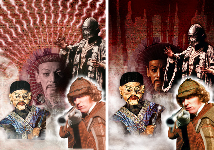
My main desire was to adjust the photo of the Doctor, which I was unhappy with the contrast of on the original cover. The dark areas were very pale and it had a rather pink overall tone. I didn't start from scratch but just readjusted the levels and colour, bringing some more accurate variation into his hat and cape, and improved some of the cutting out. My other disappointment with the original was the streaks accross the top. I think my idea had been to have them look like tears in the illustration (from Weng-Chiang's talons, do you see?), but unable to achieve that they ended up looking like energy sparks (which was fine) but too uniform. So I decided to get rid of them and just darken the background (as most of it would be covered by the logo on the final cover anyway). In revisiting the background, which I also thought was too light, I found I had applied some lighting effects to it, they just didn't show up much, so I made these stronger to boost the overall contrast. I then hit upon the idea of having some blood splatters and streaks running down the wall to symbolise Greel's reign of terror.
Finally, in recompositing the elements, I moved Greel down and decided I didn't like the way his sleeve faded out so reinstated that. To avoid clashing with Chang, this required the sewer mouth moving up so I could have the magician peering out from behind Greel. I then had to make Mr Sin larger to better fill the space. As he had been created at that size and I didn't want to redo him, being rather pleased with my original composite, I just magnified him, but only 10% or so which didn't diminish the quality significantly. Finally I did new fog with better brushes, and dropped the little rat which no longer seemed necessary.
Compare the original (left) and revised illustrations below.


