The Time Monster
23 November 2010This cover began with the image of the Master holding the Crystal of Kronos aloft, a familiar shot but one I've always felt symbolised this story wonderfully. The only downside was that I could only find mono copies of the photo so, resigned to having to do some colourisation, I chose the shot that best showed the Master's face. I used a colour photo of him in the TOMTIT lab as a reference for his shirt and tie, although these were shifted slightly by a colour overlay applied later to tie him into the overall colouring of the final composition.
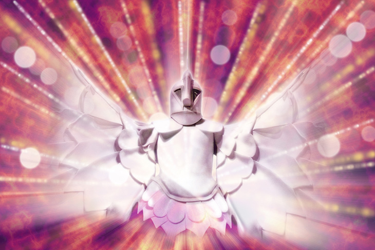
Suitable shots of the Doctor were few but this one seemed a suitable pose and expression. It was a little blurred, though, as if Jon had moved very slightly just as it was taken, but I sharpened it up as best I could. With these two images selected I knew I'd just have Kronos himself looming behind them, and luckily one of the photos of him was from a low angle that fitted the composition well. I needed to flip it, however, as it looked odd with him facing slightly left when everyone else was looking the other way. This meant I had to graft his right wing onto his left arm (or vice versa once the image was flipped) but as the original would be cut off by the edge of the frame there wasn't a problem with this being noticeable.
Finally came the choice of background. I wasn't keen on using any Greek iconography as I felt that aspect of the story only really comes in towards the end. So I composited two separate shots of the Master's lab to sit behind him (painting out a bit of Ruth in one that awkwardly stuck out behind the Master's shoulder) and decided to try an appropriately colourful (who said garish? This is Seventies Who!) background for Kronos. I wasn't at all sure quite what I'd do or how it would look, so I just played around until I had something I felt happy with. I worked on this in a separate document to the main illustration so I could apply radial blurs from the centre of the image Đ easier than trying to shift the centre of the blur to where you need it. Below is the final Kronos composition in all it's glory.


